7 Ways to Improve User Experience in Quickbase
Apr 19, 2023Are you tired of clunky, poorly designed Quickbase applications that leave you feeling frustrated and defeated?
Well, fear not my friend!
In this post, I'll be covering seven ways to improve the user experience for your Quickbase applications.
From dashboards to automated workflows, I've got you covered.
So sit back, relax, and get ready to transform your Quickbase experience from blah to brilliant!
#1 Dashboards
Picture this: you're logging into your Quickbase app and the dashboard is a hot mess. Data is scattered everywhere and you're left feeling like you need a degree in rocket science just to navigate it. Don't be the one to inflict this pain on your users! Optimize your dashboards to make their lives easier and happier.
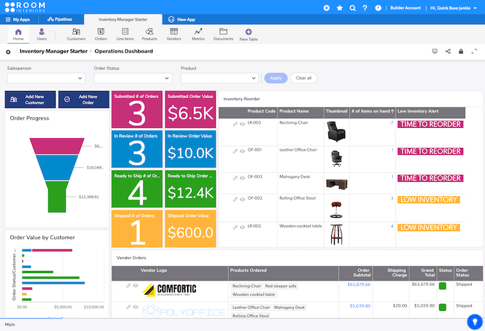
First things first, ensure the layout is visually appealing. No one wants to stare at a wall of text or table report after table report all day. Throw in some charts and graphs to break up the monotony. Trust us, your users will thank you for it. Plus, you can finally show off all those fancy KPI reports you've been working on!
Next, add some filters to the mix. This way, users can easily narrow to what is relevant to them without having to sift through a ton of irrelevant data. Speaking of which, consider assigning custom dashboards for each role in your app focused on that role's most common workflow.
Last, to show off your new and improved dashboard, don't forget to include some sweet visuals. Company logos are great, but why not go the extra mile and add icons and color to draw focus? After all, pictures are great for adding visual appeal, but even better when they help tell the story of your data.
#2 Search
Let's talk search, baby. You want your users to find what they're looking for faster than they can say "Google it." (Okay, maybe not that fast, but you get the point.) So, how can you optimize search in your Quickbase app?
If it's common for your users to navigate to a particular record of interest (say a hot sales opportunity) add a search widget to your dashboard. Make it easy for users to find the records they need without having to navigate to a specific table. And let's be honest, who doesn't love a good search bar?
Optimize search performance by allowing fields to be searched (or not). It's not likely someone will be trying to search a summary field, but they will likely want to search a text field like "Name". The more fields that are searchable the longer search will take.
Now, here's the age-old question: report dynamic filters vs search. Both have their pros and cons, but here's the deal. If your users need to filter by multiple criteria at once, say Region and Status, dynamic filters are the way to go. But if they only need to search by a specific keyword or value, search is the quicker option. It's like choosing between a leisurely stroll and a sprint to the finish line.
To add a shortcut to your field menu to choose which fields are searchable on a table, open the field list in the table's settings, click on Advanced Options on the upper right, then check the box for "Searchable". Now you can go down the list and check or uncheck which fields will be searchable.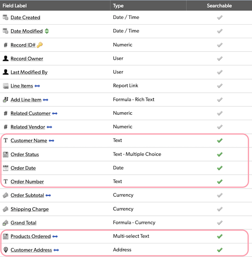
#3 Table Bar
The table bar is a little slice of your Quickbase app that can make a big difference when it comes to user experience. You might be asking yourself, "What is the table bar?" Well, let me tell you. It's the bar at the top of your app that allows users to navigate between tables. Trust me, you want this to be in tip-top shape.
First things first, think about the order of your tables. Don't be that person who leaves tables in the order you added them. Instead, put your most frequently accessed tables on the left. And don't forget you can show/hide tables based on role, so don't be shy about hiding tables that users don't need to navigate to directly.
You know those little graphics that represent each table? Don't settle for the default icons! That's like going to a party wearing sweatpants. Upgrade your icons to something eye-catching and representative of the function it performs. Oh hello price tag icon for my inventory table 👋
Admin view:
Participant view:
#4 Table Home Pages
You know that old saying, "You never get a second chance to make a first impression"? Well, that applies to your Quickbase app's table home page, too. The table home page is the first thing your users see when they click on a specific table, so you want it to be both informative and action-oriented.
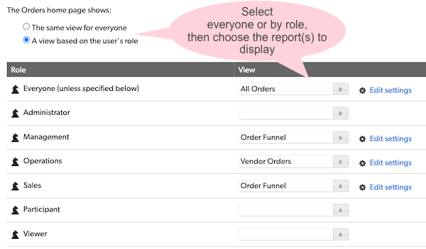
By default, the table home page displays the default report, which can get cluttered and overwhelming, especially as you add new fields. To optimize the user experience, it's a best practice to change the table home page report to something that provides greater value.
Consider what actions users will typically take on this table and what information they'll need to do so. Is there a specific report that will give them quick access to that information? Maybe a report that highlights the most urgent tasks or the most recent updates would be most helpful. Or perhaps a report filtered to records assigned to the user viewing the report. Think about what will make their experience as smooth and intuitive as possible.
To access the table home page settings, navigate to the table you want to update and click on the "Customize Page" icon in the upper right.
#5 Report Menu
Your report menu is like a menu at a fancy restaurant - you can tell a lot about a Quickbase app by how well its reports are organized. And just like how you don't want to order the wrong dish, you don't want your users clicking on the wrong report. So let's talk about how to make the report menu user-friendly.
First, organize reports into groups to make it easier for users to find what they're looking for. It's like having appetizers, entrees, and desserts all separated out. Think about what categories make sense for your app – maybe it's by department, by client, or by region. Whatever it is, grouping reports will make it less overwhelming for your users to navigate.
Another tip is to use naming conventions for your reports. You don't want to be that person who orders the "special" and then has no idea what they're getting. Similarly, you want your users to be able to quickly understand what a report is about just from its name. Use clear and concise names that accurately describe the data being presented. Bonus points if you can make them a little witty.
Lastly consider limiting roles to only create personal reports and not common reports. It's like how you don't want a stranger eating off your plate - you don't want someone accidentally messing up a report that's used by everyone. By restricting certain roles from creating or modifying common reports, you can prevent any mishaps and ensure that the report menu stays organized and easy to use.
To create a new group, open the Reports & Charts menu, click on "Organize", drag a report to the "Drag here to create new group" area, give the group a name, and check the green box. You can then drag additional reports to this group. You can also arrange the order of your reports by dragging them to new locations.
#6 Form Layout
Ah, the form layout. It's like the interior decorating of your Quickbase app. You want it to be both functional and aesthetically pleasing. After all, no one wants to fill out a form that looks like it was designed in the '90s. So, let's spruce it up, shall we?
Don't be afraid to break up your form into bite-sized chunks with clear section headers or tabs. It makes it easier on the eyes and more intuitive to navigate. Tabs are also a great way to inject a little color into your apps while also making it easy to talk others through your workflow... "now click on the green tab."
You should also consider assigning different forms to different roles. While a table may be used by many different departments, odds are they are only focused on their slice of the data. Keep your forms uncluttered and secure by assigning different forms to specific roles.
Form rules are also your best friend (the kind that you sometimes love/hate). Use them to show or hide data that's only relevant based on other selections. For example, if a user selects "yes" to the question "Are you a dog lover?" then show the hidden field for "What's your pup's name?" It's a great way to customize the form and allow users to focus on what's relevant.
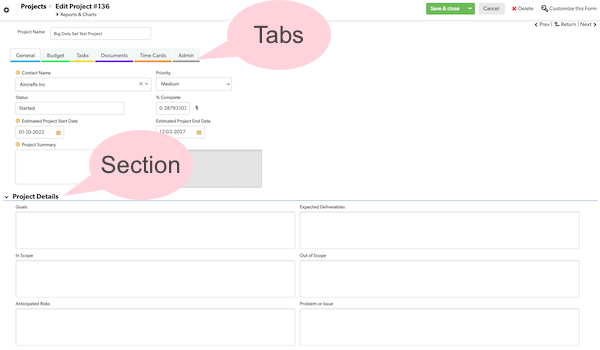 Example from the Quickbase Gantt Template App.
#7 Automated Workflows
Let's start off with formulas. They're like magic spells - just a few characters can make your data do exactly what you want it to. Whether it's calculating percentages or displaying information using HTML, formulas can simplify the user experience and eliminate the need for manual data entry. Plus, once you've created a formula, you can use it across multiple fields and records - talk about efficiency.
API buttons are a more advanced type of formula, like mini-programs that run on demand at the click of a button. They can do things like create new records or update existing ones, all without you having to leave the record you're working on. It's like having a Swiss Army knife built into your Quickbase app. So go ahead, press that button - you might just feel like a superhero.
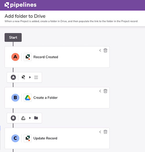
Now let's move on to the big guns - webhooks and pipelines. They're like secret agents working behind the scenes to make sure everything runs smoothly. Webhooks can trigger actions in external systems based on changes in your Quickbase app, while pipelines can automate complex data workflows between different systems. It's like having a whole team of experts working for you, without having to actually hire anyone.
Summary
Well, that's a wrap! We've covered seven essential ways to improve the user experience for your Quickbase applications. From creating user-friendly dashboards to optimizing your search and report menus, these tips will help you make your apps more efficient and enjoyable to use. And if you ever get stuck, don't worry – Quick Base Junkie has a wealth of resources to help you out.
Remember, simple touches like organizing your reports into groups or automating repetitive tasks can make a big difference. So have some fun with it and see how you can make your Quickbase applications stand out. Your users will thank you!
More from the Quickbase Optimization Series
- 5 Tips to Improve Report Performance
- More Coming Soon!


